This poll covers mean, median and interquartile range. These are statistics concepts that show up in Algebra I and sometimes earlier. You could use it as a fun review/warm-up. Practicing questions that involve finding data in charts is always good SAT/ACT review. Alternately, it would be a great exit ticket for a day where you teach students about interquartile range. Also, feel free to copy it to your dashboard and modify the questions to better fit what your students are currently covering. Either way it is a great opportunity to tie in current events and basketball into math. Who knows, you may end up observing your students making data-driven arguments for or against one of the teams.
After Task 1, we dive in to the math. The next two questions involve some review of mean and median but the real challenge is in identifying the correct data to use. Students often know how to compute mean and median, especially when the data is presented clearly in the problem. Finding it in the table adds an extra challenge but also makes it more relevant and transferable to applying statistical analysis to authentic, real-world data.
Also, when you are reviewing student data from this poll, you can quickly see which students used the wrong data by using the custom legend. If they computed the mean correctly but for the wrong score (points scored by the Warriors or against the Rockets) they will be color coded in purple. If they mixed up mean and median but were otherwise correct, they will be coded in blue.
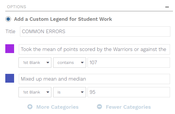
We also added a custom legend for tasks 3 and 4, we recommend you check them out before running the poll with your student.
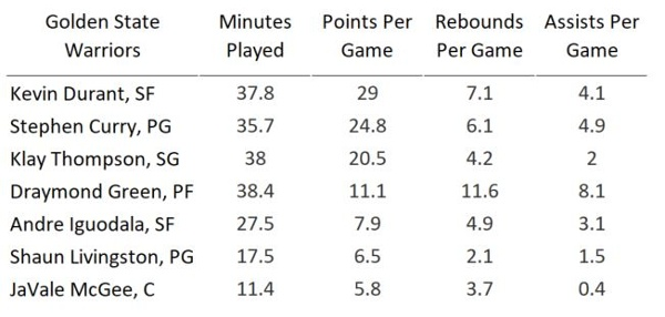
For all the questions, we give you real data that was current up until the start of the 2018 finals. Feel free to linger on one of these questions and ask your students what they notice.
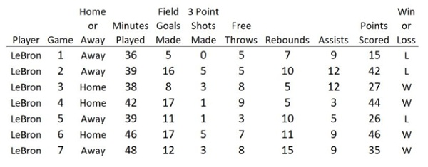
You can pause here and ask your students,
“Do you see a correlation between points scored by LeBron and if his team won or lost?”
“Does he tend to score more or less points when other statistics (rebounds, assists…) go up?”
You can also pause after the next question to ask them about how the points are distributed within a team.
Visit our page on Formative Assessment for more information on implementing these strategies in your classroom.
Stay tuned for next week’s poll!